Monday, 30 March 2015

Digipak Research (since I never really did any)


Well I've already decided what I'm going what I want to do so this is just to prove that my ideas fit with the genre.


A simple picture of the two artists looking directly into the camera. This is sort of what I want to do only my artists would be closer to the camera and possibly wearing sunglasses. I really like the simplicity and elegance of the designs. Its just the artists and their name for star image. The artists are also dressed smartly to reflect the genre and brand image.

The album 'happiness' also has deluxe versions. I particularly like the one on the left since it is only slightly different from the original. Since there is going to be a 'nemesis' edition of my album, it might be an idea to make a similarly slight change to the cover, like the positions of the artists or what their wearing.
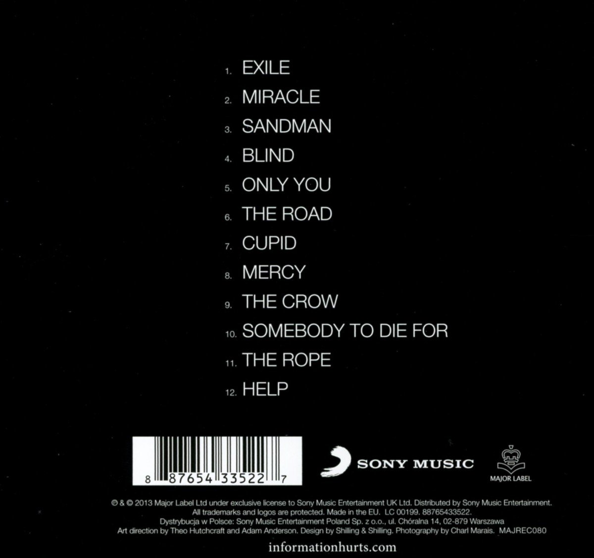

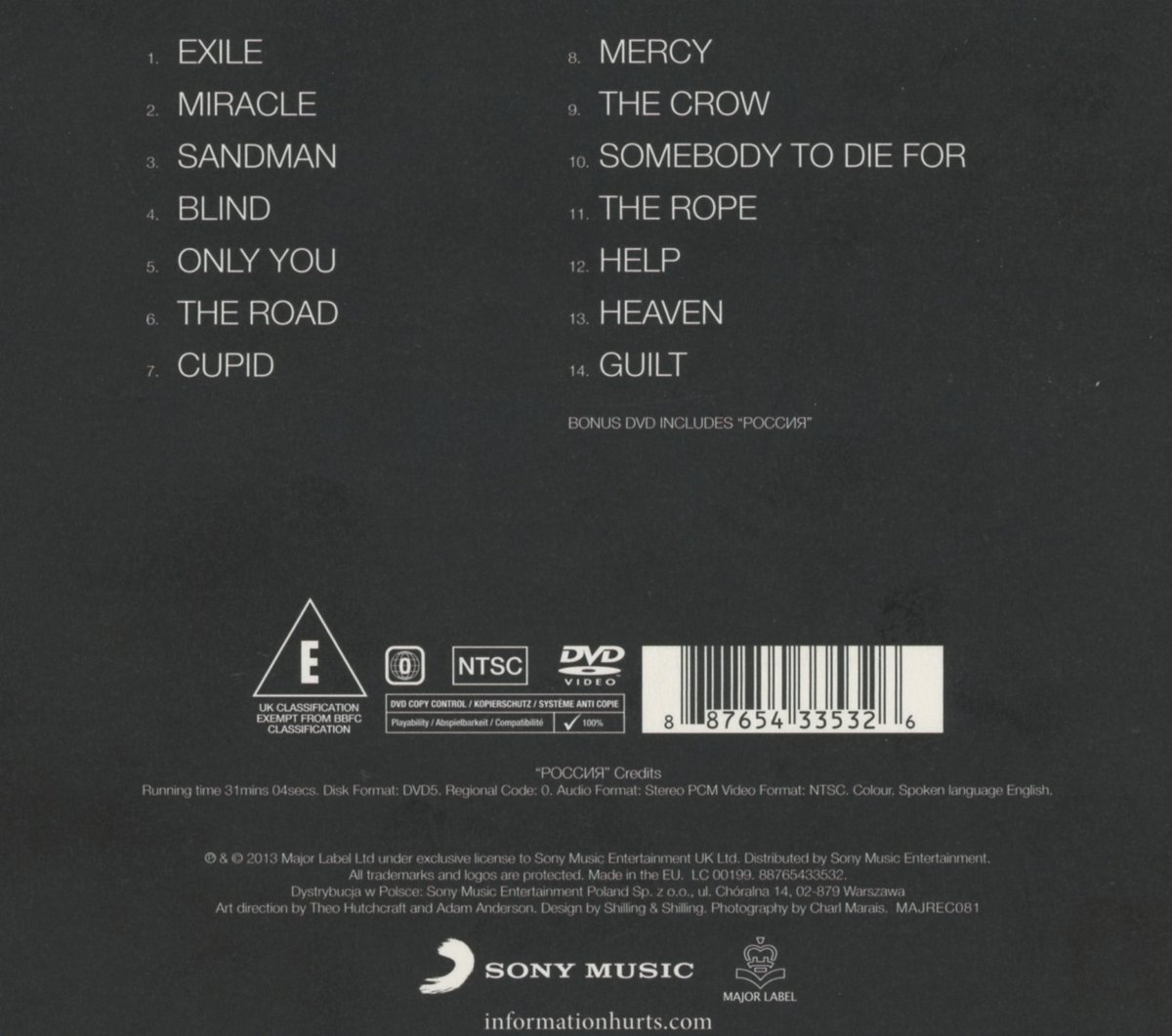
These are just here to give me ideas about the back of the cover. These ones don't include any pictures or anything so maybe mine could get away without any, it would certainly be easier.


On the left is a disk from Hurts' Exile album. I'm not sure if I have to design the disc actually... anyway if I do I'll just pretty much copy this.


Friday, 20 March 2015

Digipak Reboot

With my music video very nearly completed, it occurs to me that I STILL haven't completed my digipak. Oh dear. It also occurs to me that what little work I have don is absolutely horribly terrible and doesn't fit with anything else I have done.
So, now I'm going with an idea I had ages ago but was dismissed to the 'things I'll never do' part of my brain until now. My new digipak will be more along the lines of the 'alternative idea' in this slideshare in this post that I did ages ago:
http://jackrenshawa2media.blogspot.co.uk/2014/11/initial-digipak-ideas.html

I would still like to do an 8 panel digipak so that I can keep these two panels that I created:
http://jackrenshawa2media.blogspot.co.uk/2014/12/digipak-inside-panels-1-1.html
because I am fiercely proud of them. However, I may just ditch them so that I don't have to do as much (I'm running out of time/it might not make a significant difference to my grades/I have an unconditional offer from Uni, I don't need grades any more: I'M NOT PART OF THE SYSTEM MWAHAHAHAHAHA/it will be more effort)

So anyway, my idea is to have a silent film card theme only with inverted colours (like the website). On the front cover will be a picture of Matt and Jake's faces with shades on (possibly) and duck tape over their mouths. The duck tape will represent the silent film theme, the sinister topic of the song, and probably something stupid like the struggle against big corporations or the media. Some hippie rubbish like that...
On the other panels will just be random pictures of the two people in the high key photography studio.

Friday, 13 March 2015

How editing of the video is going

I have now colour graded the outside parts red and done some editing concerning the asylum scene's contrasts. I also took out the ghosting in the 360 shot so it has more of an impact when the guitar solo starts. I have also done loads of special effects, namely old film reel scratches on the silent film bits.

Friday, 6 March 2015

Feedback for Draft #2

I got some feedback from class, here is what i bullet pointed:


  • people like the asylum scene
  • asylum scene and silent film scene tell a story; one is before the other (I never thought of this. I always viewed them as two completely different scenes, but hey I'll go with it)
  • too much mime (sir had questioned this before aswell, but I like the mime scene so much since I always had an idea of what I wanted for it and I choreographed it and everything - maybe I'll take out/shorten the suitcase bit)
  • nice costumes
  • needs more colour and colour grading
  • someone also said that the outside bit doesn't really fit - but then I'm past caring what other people think now because we all know that I'm always right... right? I mean come on though, if I had more mime or asylum or silent film it would be repetitive! It adds to the star image! It represents the rock-y guitar bit at the end! It fits! I'm telling you it fits goddamit!