These links are probably included in other posts, they're just here for me to refer too.
http://www.digitalartsonline.co.uk/tutorials/photoshop/create-incredible-b-movie-poster-art/
http://abduzeedo.com/ironman-view-interface-effect-photoshop
http://circleboxblog.com/2009/tutorials/how-to-design-a-vintage-horror-movie-poster-in-photoshop/
Tuesday, 23 December 2014

Saturday, 20 December 2014
Digipak Inside Panels 1&2 #1
On the inside of the digipak I wanted to put something to symbolise that this was the nemesis of the digipak since these pages are the added ones. I thought some stage curtains might look quite nice and give an old fashioned sense of showmanship. However, I realised that I had to use my own images so I couldn't just get my curtains off of Google Images. In unoptimistic hope I thought you might be able to make curtains from scratch on Photoshop and well, it seems you can! I followed the instructions from the video in the top link to create the curtains and help in the creation of the text (though I'm now quite proficient in this anyways). I then wanted to make the curtains more curtain-y by putting those folded bits at the top (you know what I mean if you look at the picture). To do this I selected each half of the curtain and put them into separate Photoshop documents. I then used the knowledge I had learnt from the second link to transform them into shape. I had originally looked at the second link to see how to create curtains, but the effect in the top link was a lot better.
Monday, 15 December 2014
Digipak Back Cover #1
I had already created the image on the picture previously using those tutorials I posted. I placed this image into Photoshop and held down the Shift key whilst making the image smaller to fit so as not to distort it. I placed it so that it fit in with the shape of the text to be visually appealing. To do this I had to make the layer containing the image go below the layer containing the text so that there was no overlap.
The box at the bottom was incredibly annoying to make as you can't alter the shape of the box after you have placed it, or at least I couldn't figure out how to anyway. So, after many attempts of trying to place the box perfectly I finally succeeded. The box is coloured yellow to evoke the old horror movie posters which often had yellow boxes on to stand out and convey sickness. Next I uploaded an image of a barcode and of the DVD and Stiff Records logos. I wrote a couple of lines where the copyright info will be, though this isn't finished as you can see. Then, to fill the gap, I wrote the name of the album in the same font as on the front cover.
Digipak Front Cover #1 (and template and everything, but mainly front cover)
Today I started to properly create my digipak. I downloaded a Photoshop template of a digipak with 8 panels and 1 CD tray, though two of the panels will be for CDs on my final piece.
The first thing I did was to make the background of the template black using the bucket tool on the background layer. Now I added one of the front cover images that I had created earlier using the tutorials from previous posts;
Then I set about making the title of the album; Adversary. I looked at this YouTube tutorial so that I actually had a clue as to how to make text in Photoshop;
So, I wrote out 'Adversary' with the text tool and opened the Character window/box/thing. I set the font to Candy Buzz BTN which looks suitably spooky I think, though I may still change it to look more professional. I put the font into bold, as it seemed to look better at the time. Then I coloured the font yellow and opened the blending options. From here I had a bit of a play about, but ended up giving the text an outline using the stroke setting. I set the stroke to inside because outside looks kind of... bouffant which detracts somewhat from the scary theme. I set the colour to a green to imitate the font on this poster <<<<<. Then I went to Outer Glow and set the colour to a similar greenish colour. I had the opacity at 100%, noise at 0%, spread at 0%, and size at quite a high number, though I have just been experimenting at it looks quite spooky in the 20s so I may make some changes. Anyhow, I then went to warp text at the top. To do this the text must not be in bold so I removed that affect. I selected the flag warp affect and didn't make many changes to the default settings. Here is the product of my work:
Next I started on the other writing on the front. Again taking inspiration from >>>The Poster<<<, I want the text 'The New Album By Q~branch' to be in the top right. I considered using the Birch STD font for this, but settled on Mackintosh SF as it matched the poster more. Furthermore I used the Character and Paragraph windows/boxes/things to reduce the space between the two lines ('Q~branch' is below 'the new album by') and enlarge Q~branch both with the font size tool and horizontal scale tool so that the two lines were of the same length. I then made the 'Q-branch' (and it was Q-branch rather than Q~branch due to the font putting ~ really high up) red to match the poster. I have not yet played about with blending options for this piece of text. Here it is anyway:
The first thing I did was to make the background of the template black using the bucket tool on the background layer. Now I added one of the front cover images that I had created earlier using the tutorials from previous posts;
Then I set about making the title of the album; Adversary. I looked at this YouTube tutorial so that I actually had a clue as to how to make text in Photoshop;
So, I wrote out 'Adversary' with the text tool and opened the Character window/box/thing. I set the font to Candy Buzz BTN which looks suitably spooky I think, though I may still change it to look more professional. I put the font into bold, as it seemed to look better at the time. Then I coloured the font yellow and opened the blending options. From here I had a bit of a play about, but ended up giving the text an outline using the stroke setting. I set the stroke to inside because outside looks kind of... bouffant which detracts somewhat from the scary theme. I set the colour to a green to imitate the font on this poster <<<<<. Then I went to Outer Glow and set the colour to a similar greenish colour. I had the opacity at 100%, noise at 0%, spread at 0%, and size at quite a high number, though I have just been experimenting at it looks quite spooky in the 20s so I may make some changes. Anyhow, I then went to warp text at the top. To do this the text must not be in bold so I removed that affect. I selected the flag warp affect and didn't make many changes to the default settings. Here is the product of my work:
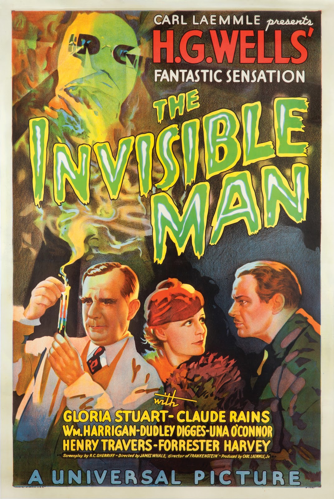
Next I started on the other writing on the front. Again taking inspiration from >>>The Poster<<<, I want the text 'The New Album By Q~branch' to be in the top right. I considered using the Birch STD font for this, but settled on Mackintosh SF as it matched the poster more. Furthermore I used the Character and Paragraph windows/boxes/things to reduce the space between the two lines ('Q~branch' is below 'the new album by') and enlarge Q~branch both with the font size tool and horizontal scale tool so that the two lines were of the same length. I then made the 'Q-branch' (and it was Q-branch rather than Q~branch due to the font putting ~ really high up) red to match the poster. I have not yet played about with blending options for this piece of text. Here it is anyway:
Saturday, 13 December 2014
(Nearly) Finished Website
http://jackrenshawasmedia.wix.com/q-branch
Its pretty much finished! Apart from a couple of photographs and the video etcetera, it is done! Here is a padlet to guide you through the site.
PS - This post is worth at least 5 normal posts.
Thursday, 11 December 2014
Chase Scene Filming
Today I did some filming around school. We did chase scenes at many of the places I had scouted before. For each take I got the actors to run one way and then run back the other way with their roles reversed. I used a tripod for most shots to keep the authentic style of silent films. I don't really know what else to say...
Wednesday, 10 December 2014
Editing #1
I started editing my video this week. I am working off of a USB and SD card to make the process quicker. I'm afraid I'm new to Powtoon so you may have to pause and enlarge the video to read all of it :)
Monday, 8 December 2014
Chase Character Outfits


 Here is the Killer's costume, there is a hat a sleeved cloak thing and a skull necklace. The hat has a mask attached but I will be tucking that into the hat so that it doesn't obscure the artists face since I need to advertise his face for him to be successful.
I will also be adding this T-shirt to the costume. As with the mime costume, I will ask my actor to wear black trousers.

This is the policeman's outfit. I got the hat from a fancy dress shop and my mum fashioned the coat from an old school blazer. I'm hoping that this costume conveys the formality of the genre.

This is the knife. I've had this for a while but I forgot to blog about it. I used it in the mime scene refilms and will use it in the chase scenes too.
Friday, 5 December 2014
Questionnaire #4

Teenage through to forties: This is the conclusion I came to as well, to incorporate the older audience there will be intertextuality towards old films.
Lighting and close ups are conventions of music videos
Monochrome and strobe lighting - I don't think the song is rocky enough for strobe lighting but I will be doing monochrome
Wednesday, 3 December 2014
Photography shoot
Last week I did a photo shoot using a jump suit in the photography studio. We tried several different positions and lighting techniques. The objective for this was to get a picture for the album cover though all the photos can be used on the website gallery of course.
UPDATE: just rereading this post after ages - sorry if any of the above sounds like a euphemism.
UPDATE: just rereading this post after ages - sorry if any of the above sounds like a euphemism.
Refilming the mime scene
This time when filming the mime scene I had a clear idea of what I wanted Jake to do on each beat. We went through the French verse with an action constituted to each line. We did several takes from one position with slightly different actions and a knife prop. After this I did several takes using the camera hand held with different actions and props. I think the results of this shoot are much better than the last. That's all I have to say really...
Monday, 1 December 2014
Subscribe to:
Posts (Atom)