These links are probably included in other posts, they're just here for me to refer too.
http://www.digitalartsonline.co.uk/tutorials/photoshop/create-incredible-b-movie-poster-art/
http://abduzeedo.com/ironman-view-interface-effect-photoshop
http://circleboxblog.com/2009/tutorials/how-to-design-a-vintage-horror-movie-poster-in-photoshop/
Tuesday, 23 December 2014

Saturday, 20 December 2014
Digipak Inside Panels 1&2 #1
On the inside of the digipak I wanted to put something to symbolise that this was the nemesis of the digipak since these pages are the added ones. I thought some stage curtains might look quite nice and give an old fashioned sense of showmanship. However, I realised that I had to use my own images so I couldn't just get my curtains off of Google Images. In unoptimistic hope I thought you might be able to make curtains from scratch on Photoshop and well, it seems you can! I followed the instructions from the video in the top link to create the curtains and help in the creation of the text (though I'm now quite proficient in this anyways). I then wanted to make the curtains more curtain-y by putting those folded bits at the top (you know what I mean if you look at the picture). To do this I selected each half of the curtain and put them into separate Photoshop documents. I then used the knowledge I had learnt from the second link to transform them into shape. I had originally looked at the second link to see how to create curtains, but the effect in the top link was a lot better.
Monday, 15 December 2014
Digipak Back Cover #1
I had already created the image on the picture previously using those tutorials I posted. I placed this image into Photoshop and held down the Shift key whilst making the image smaller to fit so as not to distort it. I placed it so that it fit in with the shape of the text to be visually appealing. To do this I had to make the layer containing the image go below the layer containing the text so that there was no overlap.
The box at the bottom was incredibly annoying to make as you can't alter the shape of the box after you have placed it, or at least I couldn't figure out how to anyway. So, after many attempts of trying to place the box perfectly I finally succeeded. The box is coloured yellow to evoke the old horror movie posters which often had yellow boxes on to stand out and convey sickness. Next I uploaded an image of a barcode and of the DVD and Stiff Records logos. I wrote a couple of lines where the copyright info will be, though this isn't finished as you can see. Then, to fill the gap, I wrote the name of the album in the same font as on the front cover.
Digipak Front Cover #1 (and template and everything, but mainly front cover)
Today I started to properly create my digipak. I downloaded a Photoshop template of a digipak with 8 panels and 1 CD tray, though two of the panels will be for CDs on my final piece.
The first thing I did was to make the background of the template black using the bucket tool on the background layer. Now I added one of the front cover images that I had created earlier using the tutorials from previous posts;
Then I set about making the title of the album; Adversary. I looked at this YouTube tutorial so that I actually had a clue as to how to make text in Photoshop;
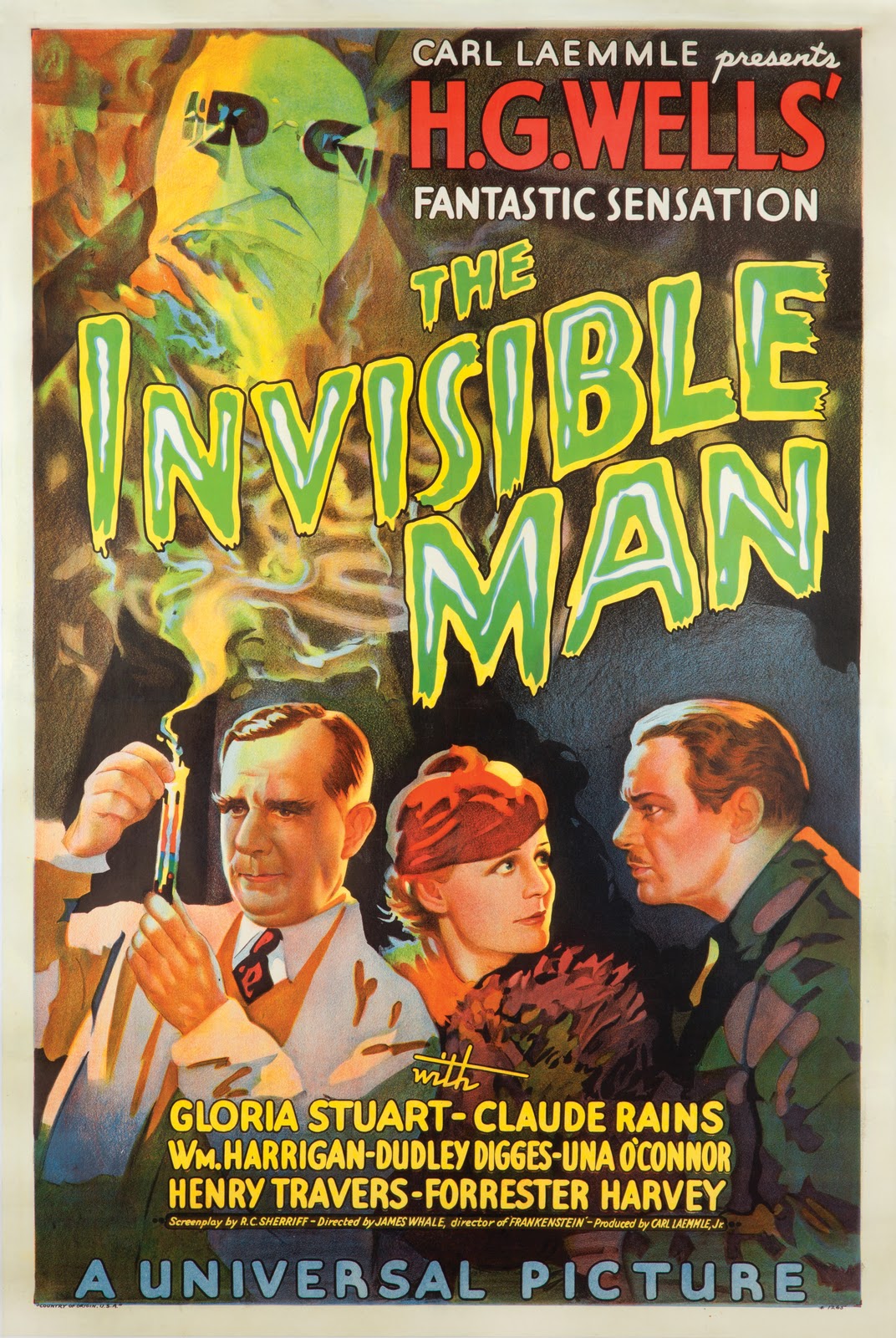
So, I wrote out 'Adversary' with the text tool and opened the Character window/box/thing. I set the font to Candy Buzz BTN which looks suitably spooky I think, though I may still change it to look more professional. I put the font into bold, as it seemed to look better at the time. Then I coloured the font yellow and opened the blending options. From here I had a bit of a play about, but ended up giving the text an outline using the stroke setting. I set the stroke to inside because outside looks kind of... bouffant which detracts somewhat from the scary theme. I set the colour to a green to imitate the font on this poster <<<<<. Then I went to Outer Glow and set the colour to a similar greenish colour. I had the opacity at 100%, noise at 0%, spread at 0%, and size at quite a high number, though I have just been experimenting at it looks quite spooky in the 20s so I may make some changes. Anyhow, I then went to warp text at the top. To do this the text must not be in bold so I removed that affect. I selected the flag warp affect and didn't make many changes to the default settings. Here is the product of my work:
Next I started on the other writing on the front. Again taking inspiration from >>>The Poster<<<, I want the text 'The New Album By Q~branch' to be in the top right. I considered using the Birch STD font for this, but settled on Mackintosh SF as it matched the poster more. Furthermore I used the Character and Paragraph windows/boxes/things to reduce the space between the two lines ('Q~branch' is below 'the new album by') and enlarge Q~branch both with the font size tool and horizontal scale tool so that the two lines were of the same length. I then made the 'Q-branch' (and it was Q-branch rather than Q~branch due to the font putting ~ really high up) red to match the poster. I have not yet played about with blending options for this piece of text. Here it is anyway:
The first thing I did was to make the background of the template black using the bucket tool on the background layer. Now I added one of the front cover images that I had created earlier using the tutorials from previous posts;
Then I set about making the title of the album; Adversary. I looked at this YouTube tutorial so that I actually had a clue as to how to make text in Photoshop;
So, I wrote out 'Adversary' with the text tool and opened the Character window/box/thing. I set the font to Candy Buzz BTN which looks suitably spooky I think, though I may still change it to look more professional. I put the font into bold, as it seemed to look better at the time. Then I coloured the font yellow and opened the blending options. From here I had a bit of a play about, but ended up giving the text an outline using the stroke setting. I set the stroke to inside because outside looks kind of... bouffant which detracts somewhat from the scary theme. I set the colour to a green to imitate the font on this poster <<<<<. Then I went to Outer Glow and set the colour to a similar greenish colour. I had the opacity at 100%, noise at 0%, spread at 0%, and size at quite a high number, though I have just been experimenting at it looks quite spooky in the 20s so I may make some changes. Anyhow, I then went to warp text at the top. To do this the text must not be in bold so I removed that affect. I selected the flag warp affect and didn't make many changes to the default settings. Here is the product of my work:
Next I started on the other writing on the front. Again taking inspiration from >>>The Poster<<<, I want the text 'The New Album By Q~branch' to be in the top right. I considered using the Birch STD font for this, but settled on Mackintosh SF as it matched the poster more. Furthermore I used the Character and Paragraph windows/boxes/things to reduce the space between the two lines ('Q~branch' is below 'the new album by') and enlarge Q~branch both with the font size tool and horizontal scale tool so that the two lines were of the same length. I then made the 'Q-branch' (and it was Q-branch rather than Q~branch due to the font putting ~ really high up) red to match the poster. I have not yet played about with blending options for this piece of text. Here it is anyway:
Saturday, 13 December 2014
(Nearly) Finished Website
http://jackrenshawasmedia.wix.com/q-branch
Its pretty much finished! Apart from a couple of photographs and the video etcetera, it is done! Here is a padlet to guide you through the site.
PS - This post is worth at least 5 normal posts.
Thursday, 11 December 2014
Chase Scene Filming
Today I did some filming around school. We did chase scenes at many of the places I had scouted before. For each take I got the actors to run one way and then run back the other way with their roles reversed. I used a tripod for most shots to keep the authentic style of silent films. I don't really know what else to say...
Wednesday, 10 December 2014
Editing #1
I started editing my video this week. I am working off of a USB and SD card to make the process quicker. I'm afraid I'm new to Powtoon so you may have to pause and enlarge the video to read all of it :)
Monday, 8 December 2014
Chase Character Outfits
 Here is the Killer's costume, there is a hat a sleeved cloak thing and a skull necklace. The hat has a mask attached but I will be tucking that into the hat so that it doesn't obscure the artists face since I need to advertise his face for him to be successful.
I will also be adding this T-shirt to the costume. As with the mime costume, I will ask my actor to wear black trousers.

This is the policeman's outfit. I got the hat from a fancy dress shop and my mum fashioned the coat from an old school blazer. I'm hoping that this costume conveys the formality of the genre.

This is the knife. I've had this for a while but I forgot to blog about it. I used it in the mime scene refilms and will use it in the chase scenes too.
Friday, 5 December 2014
Questionnaire #4

Teenage through to forties: This is the conclusion I came to as well, to incorporate the older audience there will be intertextuality towards old films.
Lighting and close ups are conventions of music videos
Monochrome and strobe lighting - I don't think the song is rocky enough for strobe lighting but I will be doing monochrome
Wednesday, 3 December 2014
Photography shoot
Last week I did a photo shoot using a jump suit in the photography studio. We tried several different positions and lighting techniques. The objective for this was to get a picture for the album cover though all the photos can be used on the website gallery of course.
UPDATE: just rereading this post after ages - sorry if any of the above sounds like a euphemism.
UPDATE: just rereading this post after ages - sorry if any of the above sounds like a euphemism.
Refilming the mime scene
This time when filming the mime scene I had a clear idea of what I wanted Jake to do on each beat. We went through the French verse with an action constituted to each line. We did several takes from one position with slightly different actions and a knife prop. After this I did several takes using the camera hand held with different actions and props. I think the results of this shoot are much better than the last. That's all I have to say really...
Monday, 1 December 2014
Sunday, 23 November 2014
Filming: Asylum Scene
I filmed the scene from a stationary angle with the tripod. Twice in normal lighting since I then told Jake to move around more, and then once each in the blue and red lighting. Then I did mobile shots in each of these lights using the camera by hand. The effect was pretty good in my opinion. I feel quite optimistic about my results so I probably won't need to refilm. (I'm keeping the set up anyway). The filming took just over and hour I think. I played the song on my computer whilst filming so that I have a link to the proper music when editing. Errrr.... not much else to say really...
Questionnaire #3

Another answered Questionnaire. This backs up most of my findings except that it insists that older generations will be more into the song. I disagree with this however as I think that people who were fans of the original would like a new version less since it is not how they remember it or they would view it as ruining a classic. As for the 'fit women' comment, that isn't really the ... idea I want to promote through my video (hypodermic needle theory) and I don't think it really fits with the new wave genre (just think of gender bending eurythmics and soft cell).
Friday, 21 November 2014
Initial Digipak Ideas
"Hey, what's your favourite album?"
"I don't know what it's called but it has a baby swimming naked on the front of it"
"oh, Nevermind."
lol joke
http://speckyboy.com/2009/11/13/30-artistic-and-creative-photoshop-poster-tutorials/lol joke
Thursday, 20 November 2014
Making a Movie Poster 2
The result of this tutorial can be found here:
Wednesday, 19 November 2014
Digipak Templates
Today I have been contemplating the overall design/blueprint/template for my digipak. The most obvious digipak is one with 4 panels and one tray which I have a basic design for in my mind (I will do a post on it soon). I have downloaded a template for this kind of digipak. However, I also downloaded one with 4 panels and two trays. I want to trays since I want to put a DVD into the album as well as the CD to just tie it into the music video a bit more. However, the problem with this template is that it leaves very little room for creative designs. Therefore I would ideally like a 6 panel digipak with two trays. Unfortunately, this does not exist... My reasoning was that just adding an extra 'page' in the middle would work but actually this would mean that there would have to be an extra plastic 'page' which just wouldn't work. Thus, I am left with an 8 panel 2 tray digipak. This gives me more work to do, but hey, that means more potential for marks so it doesn't really matter I guess. Also, as you can see in the pictures, the first two inside panels could go together nicely so might work as a 2 by 1 elongated image if you know what I mean. The two panels make up one image. Anyway, these are my thoughts so far regarding this subject.


These images are GIFs apparently so they may move or do something weird...
These images are GIFs apparently so they may move or do something weird...
Digipak Idea
Just a quick idea I got when making my 'Asylum Setting'. Something like this could go on the inside of the digipak if I need it. I'm still not sure how many panels my digipak will have. The design fits with the main track and video and the black and white theme. My only problem is that it might look a bit too heavy metal due to the font and connotations of the words.

How to Make a Movie Poster (For My Digipak)
 For my digipak I want to recreate an old fashioned horror movie poster, thus, I have looked at a couple of video and done a couple of tutorials on how to do this. On the right is the picture I used to test these tutorials on. I took it when filming the French verse. Obviously I wont use this photo in any of my actual things, its far too swag.
I didn't actually do anything for this but I watched it so...
Here are the results from this video:

 So here is the result of the video above. Obviously this is just silly, but the principle is actually quite good. I could use this in my digipak, but its still a bit too realistic for what I would ideally like. However, it got sir's approval today (yaaaaay).
I'm afraid you'll have to look really closely at this one to actually see any difference. This effect is, in my opinion, terrible and I completely resent whoever created the tutorial for it. I wasted 10 minutes of my life watching that! and for this! This effect isn't very good. However, the experience did teach me valuable lessons in using photoshop. For example, you cant give an image more than one filter effect from the 'filter gallery' unless you save it as an image and then open that to do another filter.

I read about this somewhere and completed a tutorial on it. The aim is to make a photo look like a painting. This is a very quick attempt at it and you can see how I could develop it. It is very easy to do; you simply use the blur tool in conjunction with the brush tool. Though this effect is very interesting, its still not exactly what I'm looking for. I will update my tests at stuff like this in a later post.
The Asylum Setting

So here is my idea for the asylum shot. Basically the vocalist is singing at the camera in the hannibal outfit I posted about before. The location is meant to resemble an asylum with writing all over the walls to connote insanity and also give a visible link to the lyrics. In this concept art we see words such as psycho and killer which relate to the lyrics, as well as a (very bad) drawing of a bed on fire which also relates to the lyrics. The walls will be white whilst the writing will be black so as to connote the artisticness of the artist, the formality of the genre, and the split in personality of the character.
To create the scene, I obtained several pieces of large cardboard and set about creating a set in a room in my house. Since there will only be one corner visible in the video, the set does not have to be very big. After painting the cardboard white, I gathered a load of white materials and made an attempt to create a wall, here was the result:

Now alternatively, I could have just painted the wall itself white, but I don't think that would have been as visually appealing since the cardboard and tape and cloth just gives a good texture in my opinion.
Next I set about graffiti-ing (?) these so called walls. First I made basic outlines of what I wanted to do in pencil, I wrote the words 'psycho' and 'killer' and 'kill' with some 'fa fa fa's and some 'run run away's tossed in too. These reflect the lyrics of the song. I also drew a burning bed.:


Next I had to go over the outline of this graffiti, but here I had two options; I could either go ever it in pen or paint. On one hand the paint gave a much clearer and darker outline which I thought might be picked up on camera better. I also tried painting the words by stabbing at the paper with the brush, giving a chilling effect. Furthermore, the faded effect of the paint, the rough edges of the writing and the inconsistency of the colour gives great connotations for the themes. However, you can't really pick these up on camera. The pens however, are easier to use and have more control over the style of font (I tried to use stabbing motions as i made the jagged writing) which made them a better choice. Furthermore, I thought the pens would look better as a group than the paint which would just be overwhelming.
So here is the finished product:

 Its pretty good in my opinion. The backwards 'Kill' in the centre kind of fails but the artist should be in front of that bit anyway. You may also notice the lighting. I have positioned my lights in my bedroom to focus on the set as you can see from the picture on the right. I will try to get a light from school when filming, but this will give my lighting a much needed boost just in case. I also tried some other lighting options I may wish to use...
 This room comes equipped with blue lighting back from when it was my bedroom and it was cool. These, like the main light, are moveable, so I focused both of them onto the set. This creates a melancholy and eerie mood which I will do at least one take in when filming. The only problem with this is that it creates very visible shadows as you can see.
 I also stole a lamp from the hallway which I am sure no one will miss. To my shame I have done a 'selfie' to demonstrate the effects of this light. It creates a shadowy and red tinted atmosphere that connotes danger, anger, and foreboding. This will be very good to use, especially in close ups to see angry emotions.
Sunday, 16 November 2014
Hurts
I've recently been looking at a duo called Hurts. They are primarily a synthpop artist but I know from my previous research that this genre is closely linked with new wave. Many of their songs can also be classified as new wave. These are probably the most up to date new wave band I have found.
I really like the whole concept of Hurts. The duo is made up of two men; a singer and an instrument player, which is conventional to synthpop groups (according to Wikipedia) since the genre traditionally made heavy use of synthesizers which only require one person to use. Another example of this is Eurythmics who's song Sweet Dreams I have analysed. This type of band would be ideal to me since I only have two people who can definitely be in it (and they're both male) and I think it just an interesting idea. I also realised that whilst Sweet Dreams and Eurythmics pushed boundaries by gender bending, I can say that I have done the same thing since Matthew has long hair (its not much but still).
The Hurts website is also interesting;
 Music videos are constantly playing in the background to advertise them and the artist.
 You can see lots of things by scrolling down. All text is in the font of the logo. Emphasis on live shows and album. There is a navbar and social media icons. Pics labeled as photography perhaps to seem more professional.
 By clicking the thing next to the logo (or is it part of the logo?) most of the page disappears to reveal the music video. This is really really cool but there is no way for me to replicate it on wix unfortunately.
I really like the whole concept of Hurts. The duo is made up of two men; a singer and an instrument player, which is conventional to synthpop groups (according to Wikipedia) since the genre traditionally made heavy use of synthesizers which only require one person to use. Another example of this is Eurythmics who's song Sweet Dreams I have analysed. This type of band would be ideal to me since I only have two people who can definitely be in it (and they're both male) and I think it just an interesting idea. I also realised that whilst Sweet Dreams and Eurythmics pushed boundaries by gender bending, I can say that I have done the same thing since Matthew has long hair (its not much but still).
The Hurts website is also interesting;
Friday, 14 November 2014
Filming: French Verse
On Tuesday night I decided to film the French scene in the photography studio. This is the scene where the psycho killer is dressed as a mime and sings.
I ended up having the killer sing the whole song in case he did anything interesting, but here is the parts of the song I was most interested in;
Ce que j'ai fais, ce soir la
Ce qu'elle a dit, ce soir la
Realisant mon espoir
Je me lance, vers la gloire ... OK
We are vain and we are blind
I hate people when they're not polite
Psycho Killer,
Qu'est-ce que c'est
fa fa fa fa fa fa fa fa fa far better
Run run run run run run run away
Psycho Killer,
Qu'est-ce que c'est
fa fa fa fa fa fa fa fa fa far better
Run run run run run run run away
oh oh oh oh oh oh oh oh....
Ce qu'elle a dit, ce soir la
Realisant mon espoir
Je me lance, vers la gloire ... OK
We are vain and we are blind
I hate people when they're not polite
Psycho Killer,
Qu'est-ce que c'est
fa fa fa fa fa fa fa fa fa far better
Run run run run run run run away
Psycho Killer,
Qu'est-ce que c'est
fa fa fa fa fa fa fa fa fa far better
Run run run run run run run away
oh oh oh oh oh oh oh oh....
I decided that only this portion of the song would be sung in this scene due to my research into other videos. Most new scenes and costumes in music videos are introduced at a new part of the music. Since I wanted to introduce this scene during the French verse, it is likely that it is only this portion of the song in which it will appear.
I did several takes from a generic mid/long shot camera angle and a couple of close ups too. I did not do as much as I would have liked and I may need to do more for that scene. I also took ma couple of photos.
I ended filming for the whole of the song since I thought i could take any particularly good actions the vocalist made and put them anywhere in the song. However, this means I do not have a very good start for the french verse and subsequently need to refilm. This will be a good opportunity however, as my actor will know his lines better and I know what to tell him to de otc. I can try things differently and stuff.
I did several takes from a generic mid/long shot camera angle and a couple of close ups too. I did not do as much as I would have liked and I may need to do more for that scene. I also took ma couple of photos.
I ended filming for the whole of the song since I thought i could take any particularly good actions the vocalist made and put them anywhere in the song. However, this means I do not have a very good start for the french verse and subsequently need to refilm. This will be a good opportunity however, as my actor will know his lines better and I know what to tell him to de otc. I can try things differently and stuff.
Tuesday, 11 November 2014



Sunday, 9 November 2014
Ancilliary Task Ideas
Alongside my website I am allowed to do either a digipack or poster for my music artist. I am not yet sure which one will be best. I would have thought that a digipack would be harder since you need at least 4 panels. However, this makes me think that it will be easier to put enough stuff into them in order to gain top marks. Anyhow, my idea for either one is to do something in the style of an old horror movie, which is the kind of thing I want to present in my music video. The problem with this is that it will not match the conventions of the new wave genre. None the less, this is my idea for now, but it depends on how my video turns out.


Saturday, 8 November 2014
Settings: Chase #1


A good urban corner in an enclosed space. This is ideal for acting as well as they can run around the corner in the silent film style. It doesn't look too new either; it is suitably dreary to set the mood.

 A zigzag path means that this location is ideal for the over the top running and turning in chase scenes. This is yet another urban location too although there are some plants visible. I could also just use this brick wall as a basic backdrop, which is what I would like to do.
This location is a bit too open and rural for my liking. I want more enclosed spaces so that I can control the lighting, which is, in my opinion, the biggest difference between amature videos and proffesssional ones. Having said that, I could use just a small part of this wall for a basic backdrop.


This is near to the third setting. It's relatively enclosed and very urban and dreary. It could make a good shot.


This is a rural space again but I still thought it would be worth considering as a plain backdrop.


Another rural space that is quite open. I thought a shot of this long space in the dark might be quite scary though.
An urban backdrop again. I'm not sure if its a little too clean or modern though...
Another dreary urban space that might be good for an odd shot.
Settings: Corridors


Here are a bunch of photos I took at school in order to find suitable locations in which to film. First off, here are some corridors for the scooby doo scene. These first few images were taken in the post 16 building. These are the longest corridors and therefore the most suitable. With the lights switched off, these corridors will look less schooly hopefully, you can see in the first photo that with the lights turned off, its actually quite sinister. These corridors have lots of doors on either side as well, with the exception of the top right.


This corridor is certainly very long, however, there are a minimal amount of doors and lots of windows which would make lighting difficult.


These corridors are in the new maths block at school. They are a bit too short and a bit to happy in terms of colours to be used, though lighting would be easy to control in these.
Subscribe to:
Posts (Atom)