Saturday, 25 April 2015

FINAL POST

We have come to the end of our journey. Although for the examiner this is the first they will know of that journey... Anyway, this post contains all the final products and evaluations that you need to look at. All the posts are labeled though it would still be easier to just go through the blog chronologically.
Yours Sincerely, Jack Renshaw.


THE PRODUCTS:

Music Video: Psycho Killer by Q~branch

Website:
http://jackrenshawasmedia.wix.com/q-branch

Digipak: Adversary (Nemesis Edition) by Q~branch
(For close ups of each panel see HERE)


THE EVALUATIONS:

In what ways does your Media Product use, develop or challenge forms and conventions of real media products?
http://jackrenshawasmedia.wix.com/evaluationquestion1

How effective is the combination of your main product and ancillary texts?

How did you use your audience feedback?

How did you use Media Technologies in the construction and research, planning and evaluation stages?

That's all folks:)

Thursday, 23 April 2015

Final Website

Final Website

I would put a picture here but unfortunately Blogger at school is a **** ***** ***** *******  ****

Wednesday, 22 April 2015

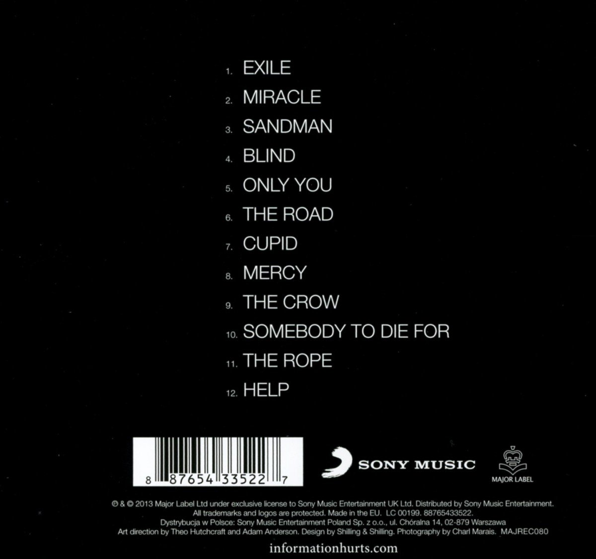
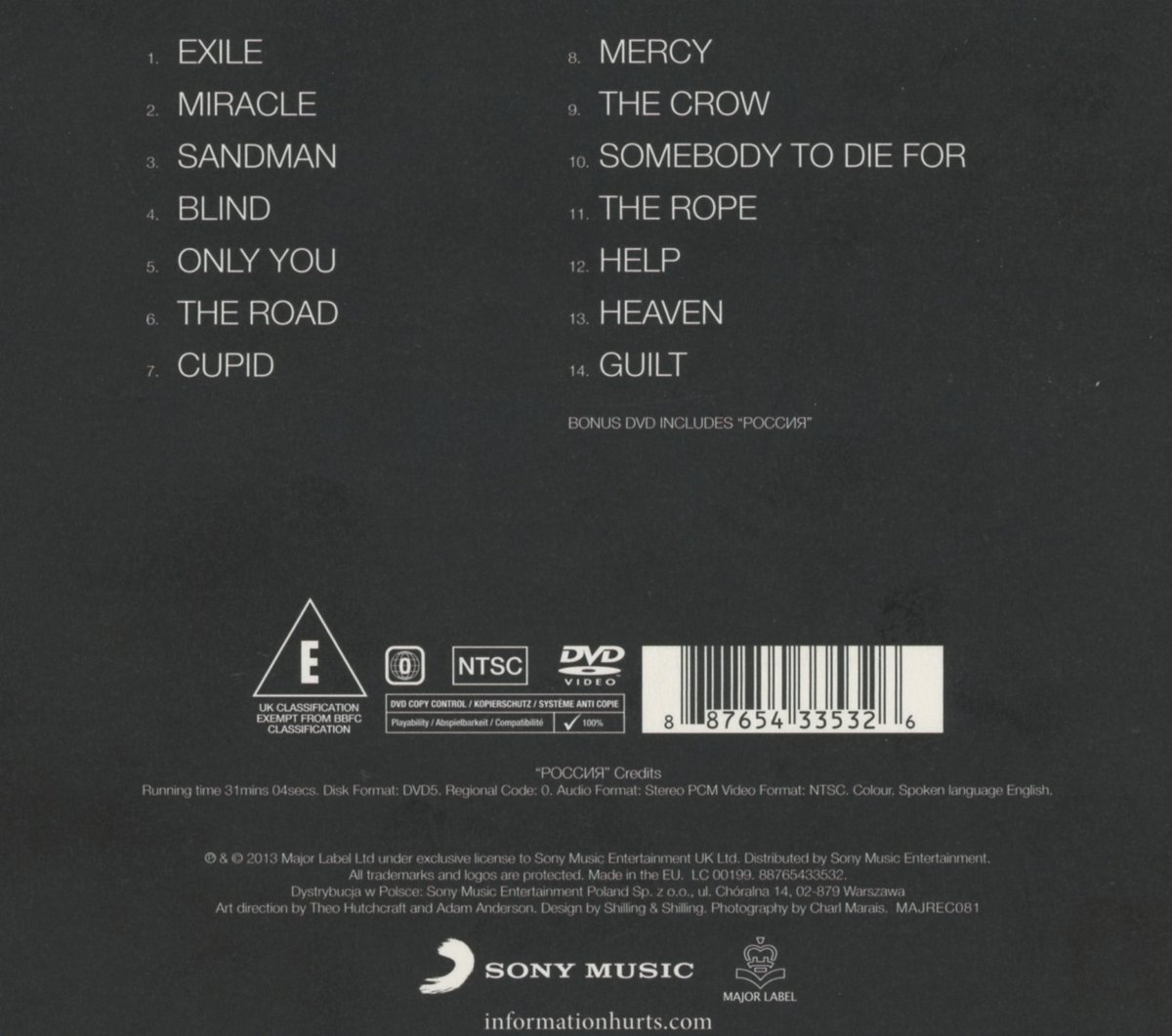
Finished Digipak

So over the last week I have finished my digipak. First off I had to create the parallel lines that would be the border for nearly all of my panels. Having previously tried and failed to create decent parallel lines on photoshop, I noticed I still had a screen shot of the parallel lines from The Sounds' website so I just decided to use that. Lining these up into a square border was easy - but I wanted the corners to be curvy to be more fancy. This was the incredibly annoying part. On my Photoshop Elements 10 programme at home I cannot transform an image in this way, so I had to do it at school. Remember when I learned to transform an image to create nice looking stage curtains in THIS POST? Well, I applied the knowledge I had learned there to distort the lines. This was also quite problematic as I couldn't create an arc to the angle I desired without transforming the size (and therefore thickness) of the lines. So I had to move the arc about and cut parts off of it with the marquee tool. After creating the border for my panels the rest was pretty much just easy. I edited the text on the front a bit using the techniques I have previously leaned to make it look more appealing. I looked at a couple of album covers (HERE and HERE) to see what to include at the bottom of the back cover. I also did some basic research to see what types of things to include on the inside cover such as vocal and music credits. I also did research into each song on the album to see which company owned it. I then put these companies' logos onto an inside cover. For the sake of variety I did not use the Book Antiqua font throughout and decided to look up which font is used in the logo of the synthpop duo Hurts, whom I have done extensive research. As you can see HERE, the font is Goudy Old Style with an inner glow. After all this I waited a couple of days until Thursday when me and my friends all see each other after school, giving me a good opportunity to take a picture of Matt and Jake. Thus, on Friday I was able to insert the picture onto the front cover. I got rid of the background on the image with the marquee too and could easily make it black and white. I played around with the levels to make it look nice. Then using THIS TUTORIAL I was able to make the bottom part of the photo fade into the background. That's pretty much it, these are the results;


<Front

Back> 


The two inside panels:

<This one is inspired by the set of the Asylum Scene in the video

This one contains all the information>


<Where the two discs go. These are just the same image btw.>


 The curtains that I had done before add some 'panaz' to the special edition

Here is the final piece with my own made measurements (which I basically just took from templates on google images).
Below is the upside down version so that you can read the inside panels, however, the upside down version is not quite how it should look since it is a reflection rather than... I dunno this is really confusing. The inside information panel would in real life be on the left. The below image also has incorrect measurements, although they are upside down anyway. Also, isn't it weird how 'Edition' looks the same upside down...


Tuesday, 21 April 2015

Evaluation Question 1

In what ways does your Media Product use, develop or challenge forms and conventions of real media products?

Monday, 20 April 2015

Evaluation Question 2


How effective is the combination of your main product and ancillary texts?

Sunday, 19 April 2015

Evaluation Question 3

How did you use your audience feedback?
 

Saturday, 18 April 2015

Evaluation Question 4

How did you use Media Technologies in the construction and research, planning and evaluation stages?

Mixbook - Create stunning photo books, cards and calendars! | Design your own Photo Book with Mixbook's easy online editor.

Monday, 30 March 2015

Digipak Research (since I never really did any)


Well I've already decided what I'm going what I want to do so this is just to prove that my ideas fit with the genre.


A simple picture of the two artists looking directly into the camera. This is sort of what I want to do only my artists would be closer to the camera and possibly wearing sunglasses. I really like the simplicity and elegance of the designs. Its just the artists and their name for star image. The artists are also dressed smartly to reflect the genre and brand image.

The album 'happiness' also has deluxe versions. I particularly like the one on the left since it is only slightly different from the original. Since there is going to be a 'nemesis' edition of my album, it might be an idea to make a similarly slight change to the cover, like the positions of the artists or what their wearing.


These are just here to give me ideas about the back of the cover. These ones don't include any pictures or anything so maybe mine could get away without any, it would certainly be easier.


On the left is a disk from Hurts' Exile album. I'm not sure if I have to design the disc actually... anyway if I do I'll just pretty much copy this.


Friday, 20 March 2015

Digipak Reboot

With my music video very nearly completed, it occurs to me that I STILL haven't completed my digipak. Oh dear. It also occurs to me that what little work I have don is absolutely horribly terrible and doesn't fit with anything else I have done.
So, now I'm going with an idea I had ages ago but was dismissed to the 'things I'll never do' part of my brain until now. My new digipak will be more along the lines of the 'alternative idea' in this slideshare in this post that I did ages ago:
http://jackrenshawa2media.blogspot.co.uk/2014/11/initial-digipak-ideas.html

I would still like to do an 8 panel digipak so that I can keep these two panels that I created:
http://jackrenshawa2media.blogspot.co.uk/2014/12/digipak-inside-panels-1-1.html
because I am fiercely proud of them. However, I may just ditch them so that I don't have to do as much (I'm running out of time/it might not make a significant difference to my grades/I have an unconditional offer from Uni, I don't need grades any more: I'M NOT PART OF THE SYSTEM MWAHAHAHAHAHA/it will be more effort)

So anyway, my idea is to have a silent film card theme only with inverted colours (like the website). On the front cover will be a picture of Matt and Jake's faces with shades on (possibly) and duck tape over their mouths. The duck tape will represent the silent film theme, the sinister topic of the song, and probably something stupid like the struggle against big corporations or the media. Some hippie rubbish like that...
On the other panels will just be random pictures of the two people in the high key photography studio.

Friday, 13 March 2015

How editing of the video is going

I have now colour graded the outside parts red and done some editing concerning the asylum scene's contrasts. I also took out the ghosting in the 360 shot so it has more of an impact when the guitar solo starts. I have also done loads of special effects, namely old film reel scratches on the silent film bits.

Friday, 6 March 2015

Feedback for Draft #2

I got some feedback from class, here is what i bullet pointed:


  • people like the asylum scene
  • asylum scene and silent film scene tell a story; one is before the other (I never thought of this. I always viewed them as two completely different scenes, but hey I'll go with it)
  • too much mime (sir had questioned this before aswell, but I like the mime scene so much since I always had an idea of what I wanted for it and I choreographed it and everything - maybe I'll take out/shorten the suitcase bit)
  • nice costumes
  • needs more colour and colour grading
  • someone also said that the outside bit doesn't really fit - but then I'm past caring what other people think now because we all know that I'm always right... right? I mean come on though, if I had more mime or asylum or silent film it would be repetitive! It adds to the star image! It represents the rock-y guitar bit at the end! It fits! I'm telling you it fits goddamit!

Wednesday, 14 January 2015

Editing Update

'cause I havn't done one in a while


Thursday, 8 January 2015

More Filming

Having looked at a couple of Hurts videos, I realized that the video does not really convey Matt as part of the act. Therefore, I decided to do some shots with both of them in a performance based scene. Like the Hurts videos I have looked at, Jake is in the fore, singing some lines, whilst we can see Matt in the background playing a guitar (I knew that guitar would come in handy eventually!). This is conventional of music duos and of the synthpop genre, which can be considered a branch of new wave. I mainly wanted this scene to focus on Matt, so the
majority of shots I did are of Matt playing the guitar. I used shots which I have previously seen used in videos (the ones by The Sounds come to mind). Furthermore, I decided to try out the 'steady cam' thingy which you attach the camera to and hold to try to get a smooth shot whilst moving. The shot I used it for is quite good in general, especially when you think it will only be seen in snippets, however, the steady cam does not work. I don't know whether I managed to use it wrong or something (its just holding it though isn't it? surely even I can't do that wrong) but the shot is just as shaky as I feared it would be without. Maybe it wasn't designed to prevent shakiness at the amount/speed I was moving? I dunno.

Here I have attached screenshots of some of the things I was talking about via DeviantArt: