Today I started to properly create my digipak. I downloaded a Photoshop template of a digipak with 8 panels and 1 CD tray, though two of the panels will be for CDs on my final piece.
The first thing I did was to make the background of the template black using the bucket tool on the background layer. Now I added one of the front cover images that I had created earlier using the tutorials from previous posts;
Then I set about making the title of the album; Adversary. I looked at this YouTube tutorial so that I actually had a clue as to how to make text in Photoshop;
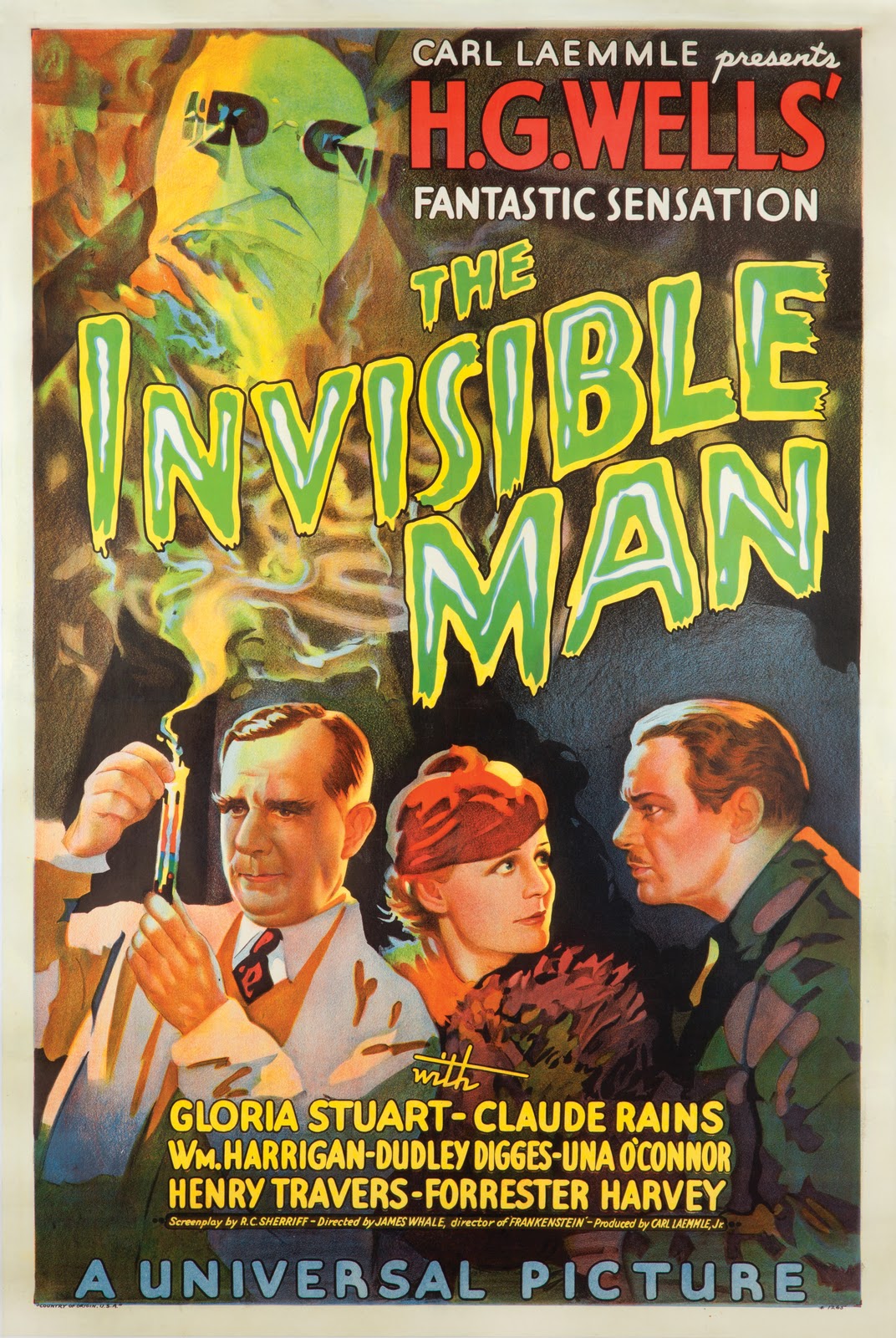
So, I wrote out 'Adversary' with the text tool and opened the Character window/box/thing. I set the font to Candy Buzz BTN which looks suitably spooky I think, though I may still change it to look more professional. I put the font into bold, as it seemed to look better at the time. Then I coloured the font yellow and opened the blending options. From here I had a bit of a play about, but ended up giving the text an outline using the stroke setting. I set the stroke to inside because outside looks kind of... bouffant which detracts somewhat from the scary theme. I set the colour to a green to imitate the font on this poster <<<<<. Then I went to Outer Glow and set the colour to a similar greenish colour. I had the opacity at 100%, noise at 0%, spread at 0%, and size at quite a high number, though I have just been experimenting at it looks quite spooky in the 20s so I may make some changes. Anyhow, I then went to warp text at the top. To do this the text must not be in bold so I removed that affect. I selected the flag warp affect and didn't make many changes to the default settings. Here is the product of my work:
Next I started on the other writing on the front. Again taking inspiration from >>>The Poster<<<, I want the text 'The New Album By Q~branch' to be in the top right. I considered using the Birch STD font for this, but settled on Mackintosh SF as it matched the poster more. Furthermore I used the Character and Paragraph windows/boxes/things to reduce the space between the two lines ('Q~branch' is below 'the new album by') and enlarge Q~branch both with the font size tool and horizontal scale tool so that the two lines were of the same length. I then made the 'Q-branch' (and it was Q-branch rather than Q~branch due to the font putting ~ really high up) red to match the poster. I have not yet played about with blending options for this piece of text. Here it is anyway:

No comments:
Post a Comment